GREAT Visualization
- Former user (Deleted)
- Erich Weiler
- Former user (Deleted)
- Former user (Deleted)
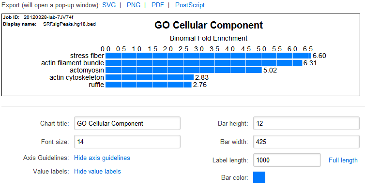
Table Visualization: Bar chart of current sorted value
|
Table Visualization Interface |
What?
The "bar chart" will plot a single statistic for the visible terms in the table. The plotted statistic is the one by which the table is currently sorted.
Why?
Many of our users have converted their GREAT results into figures (or rather figure panels) for publication. To make this process easier, we have added
built in bar plotting capabilities.
Features
- Modifiable colors and size of bars
- Change font and size of text
- Editable title
- Export as raster (PNG) or vector (SVG, PDF, PS) for post processing
- The vector graphics should be especially useful for scaling the bars for each ontology to be comparable in tools such as Adobe Illustrator
Ontology Visualizer: Visualize shown terms in hierarchy
|
Ontology Visualization Demo |
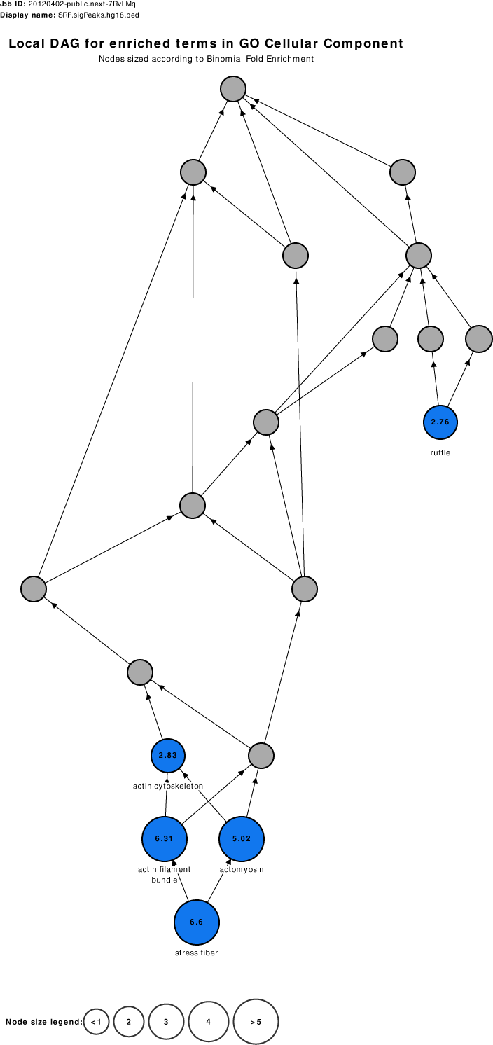
What?
Visualize the terms that are currently visible in the table (blue) and all their parents (gray). The size indicates the fold enrichment of the term.
Why?
Allows you to see the relationship between the enriched terms to gain better understanding of your set. For example, in the example on the right,
you see several "actin" related enrichments such as "actin cytoskeleton" and then "ruffle" is enriched elsewhere in the ontology structure. This raises
the question- "Is ruffle a different functional enrichment?". Looking at the term details for "ruffle" reveals that it is referring to the "projection at
the leading edge of a crawling cell...supported by a microfilament meshwork". So we are able to understand that our set is involved not just in regulating
"actin" fibers and the cytoskeleton of the cell, but also in creating protrusions on the cell membrane that aid under certain conditions in mobility.
Features
- Modifiable fold enrichment bins
- Re-arrangeable nodes
- Export as raster (PNG) or vector (SVG, PDF, PS) for post processing